Friday, October 30, 2009

Happy Halloween!


I just sat down this evening to get a post up and found that the piece of art that I wanted to share is delightfully Halloween appropriate! So, enjoy the art, enjoy the holiday, and enjoy some zombies I guess.

Sunday, October 18, 2009

Revising my development process

I've been having fun working with a new process for creating book three. Instead of handling the book one page at a time, start to finish, I have been working through the whole book all at once in phases: layout, sketches, pencils, inks. It's sort of like being a one-man assembly line. Using this method I have already completed the first draft of writing and layout for this issue and am about half way though the sketching.

This has been exciting on a number of levels (and I will probably go into more detail in subsequent posts) but the number one thing that this has done for me so far is it has allowed me to see the writing process unfold very quickly through a series of iterations. I got started by breaking down the events of the narrative into a page-by-page sequence and then divided that up into simple panel layouts and basic dialog. At this point I can take a first simple read-through of the story, sans images but with a rough idea of pacing.


Following this step I proceeded to measure out all the panel divisions for all twenty-eight pages of the issue. I enjoy doing this because it allows me to trace off the exact size and proportion of each panel in the book when I sit down to do my sketch-layouts of the content. Before I proceed to sketch layouts themselves. The result is a series of large, pre-pencil, sketch-compositions from which I lightbox when I start penciling.


While I have used this sketch method in the past, this is the first time that I have done large segments of a story in sketch form before proceeding to finish work. By doing it this way I am already getting a preview of how the story will actually read before I commit to development that will be too
costly (in terms of time) to fix. I expect that in a couple of weeks I will have finished this next phase of development and will be in a position to read through another iteration of the story and begin making serious edits as necessary.


I'll have more pictures as I complete the sketches and move into the penciling phase of the project (one of my secret hopes is that the new process will force me to take my pencils more seriously as preparatory work for finished inks). Stay tuned!

Wednesday, May 13, 2009

Moving to a new location!

My new site is up and ready to accept visitors.

Very special thanks to Ian Wilson for the design. I'm really excited to have my own site again and I'm looking forward to having it grow with me. I've had a few domains over the years and I've always had to scrap the site once I switched projects, so for once I decided to go with a domain that I can keep.

Check it out!

www.ewlynchcomics.com

Wednesday, April 15, 2009

Feeling in the groove.

Just finished inking a page. I've been waivering back and forth between tech pens and brushes for a little while. I went all brushes on this one and I think I'm finally getting the hang of them. It felt natural, and I loved working with them. It was a nice change of pace.

Thursday, April 2, 2009

Big changes coming soon!

It is really late, so I will keep this brief. This blog will be moving soon to a new location on my very own webpage. Development is coming along swimingly (thanks to a friend who I will credit in due time) and the design is looking great; so I'm pretty excited about it. I will drop a link here when the move takes place, so keep checking back.

In the meantime, some drawings!


Tuesday, March 10, 2009

Zack Snyder: Typist

The following excerpt is taken from the script of the Cohen's Brother's film The Man Who Wasn't There.

STUDIO

               Ed enters, uncomfortable. He looks around, taking in the 
               high-ceilinged space, which is dominated by a grand piano.

               Carcanogues has followed him and now runs water from a tap.

                                     CARCANOGUES
                         I speak to you on ze phone, non? You 
                         have a special interest in music?

                                     ED
                         Uh-huh.

                                     CARCANOGUES
                         Ah yes, a music lover.

                                     ED
                         Well, I don't pretend to be an expert.

                                     CARCANOGUES
                         Ah.

               He uncaps a small bottle of pills, shakes two into his palm, 
               tosses them back and washes them down.

                                     CARCANOGUES
                         ...Ah-hah.

               He twists a cigarette into a long holder, sticks it in his 
               mouth and lights it.

                                     CARCANOGUES
                         ...Mm.

                                     ED
                         Well? How'd she do?

               This elicits a Gallic frown of consideration.

                                     CARCANOGUES
                         Ze girl?... She seems like a very 
                         nice girl. She *plays*, monsieur, 
                         like a very nice girl. Ztinks. Very 
                         nice girl. However, ztinks.

                                     ED
                         I don't understand.

                                     CARCANOGUES
                         Is not so hard to understand. Her 
                         playing, very polite.

                                     ED
                         Did she make mistakes?

               Another gallic moue:

                                     CARCANOGUES
                         Mistake, no, it says E-flat, she 
                         plays E-flat. Ping-ping. Hit the 
                         right note, always. Very proper.

                                     ED
                         I don't understand, no mistakes, 
                         she's just a kid--I thought you taught 
                         the, uh, the--

                                     CARCANOGUES
                         Ah, but that is just what I cannot 
                         teach. I cannot teach her to have a 
                         soul. Look, monsieur, play the piano, 
                         is not about the fingers. *Done* 
                         with the fingers, yes. But the music, 
                         she is inside. Inside, monsieur...

               A two-handed gesture, indicating his heart.

                                     CARCANOGUES
                         ...The music start here...

               He waggles his fingers:

                                     CARCANOGUES
                         ...come out through here; then, 
                         maybe...

               His wave takes in the heavens:

                                     CARCANOGUES
                         ...she can go up there.

                                     ED
                         Well, look, I don't claim to be an 
                         expert--

                                     CARCANOGUES
                         Then you listen to me, for I am 
                         expert. That girl, she give me a 
                         headache. She cannot play. Nice girl. 
                         Very clever hands. Nice girl. Someday, 
                         I think, maybe, she make a very good 
                         typist.

Saturday, February 28, 2009

A little something I worked on for Christmas

Here's a piece I worked on for my Fiancee Rebekah. I got her a book for Christmas, but the cover was so bad that I thought I'd do a new one. In the end my own cover had its own set of issues, but I thought I'd share it anyways.
In color.
In black & white.

I had a bunch of musings to post on digital coloring, the peril of pink skies (it's supposed to be dawn), and illustration as cover art, but I'm out of time and I have to go. Maybe someday.

Monday, February 9, 2009

This was really hard.

I don't like to brag (feel free to dispute this I guess) but I also don't appreciate false modesty, and when I have done something hard I want people to know how hard it was. I took several cracks at this image, and wasted a lot of time trying to figure out the perspective in it. You can see several of those attempts below. The final image is by no means perfect, it does have plenty of compositional issues that we could critique to no end, but the perspective is sound. It looks a little wonky at first glance (that's one of the compositional issues) but by all means, look very hard at the perspective. It works. I'm proud of that.


This was a second attempt, building off of lessons learned in the first. At this point I am lightboxing together two layers of perspective because having all the vanishing points on the same piece of paper was throwing me off.


This is an example of one of the perspective objects that I lightboxed in. I pinpointed the axis on which the cube would pivot so that I could line it up with axis on the ship's gyroscopic thingy.


The first attempt. This one got so messy that I had to start fresh. Also, the cube is wrong.


The finished product. 

Wednesday, February 4, 2009

This blog is not dead. I am not dead.

Hello all.

It has been a while. I am stopping work for a brief moment to let the whole world know that this blog is not dead. If you follow this blog, and you don't personally know me, I am not dead. I haven't posted much recently because I have been frequently between jobs, and harried with learning new skills (ones that earn money), and sorting out getting married, and eeking out a very little time to draw.

Since I get so little done these days, I haven't been spending any of it on blogging about the drawing that I never get to do. One of the things on my list of things to do (what I am taking a break from right now) is learning web development, and building myself a personal site. When I do I may just install wordpress and move my blog there, but at least the spirit of this blog will live on.

At any rate, don't give up on me yet.

And what the heck, look at this picture!

I was totally going to write some great stuff about process. Oh well. Maybe next time.

Saturday, May 31, 2008

Con wrap up

Just a quick post here. I wanted to post the commissions I did at the con for any one who was interested. The first one was commissioned by a gentleman who apparently has the world's largest Iron Giant collection. It is pretty impressive. He came up to my booth and said that it didn't seem like I minded drawing robots. I said that that I certainly did not and he asked if I wouldn't mind adding to his collection. I was surprised because I had not quite anticipated this. In truth I had been worried that someone would come along and ask for a Catwoman pinup or something, but as soon as The Iron Giant commission was requested I realized how foolish this was. Of course no one was going to ask for something I couldn't draw because all anyone knows about me is what they see right in front of them. All my commissions were for robots and machines because that was the crowd my work attracted. Besides that the guy who drew Catwoman pinups was sitting in the booth across from me, and he was kept busy all convention.

The Iron Giant pinup can be viewed here.

My other two commissions were from a gentleman who circulated a number of sketch books all over the convention and had artists work on illustrating characters in a story of his own. I designed a space suit for a tiger furry named Earl McClaw and a destroyer ship for one of his friend's universes.

Earl McClaw in space combat gear.

Maybe the best space ship I have drawn to date. I whipped this out in a surprisingly short amount of time and rediscovered why I like tech pens.

More later. Hopefully some sneak peaks and panels, prints, and sketches. My friend was right, this blog is better with pictures.

Tuesday, May 27, 2008

Motor City in Review

As always I am behind on keeping the blog up to date. I probably should have announced that I would be attending the Motor City Comic Convention before hand, and not after, but I really didn't think to because until the Con the only people who read this space were people who knew me. And then I started selling books to strangers...

The Motor City Comic Convention was a really great experience for me. It was my first con, and my first chance to peddle my book to strangers and get honest feedback and encouragement. It was great to see people take an interest in the art and story, especially when someone would come by the booth and then go take a look at the rest of the con and come back. It let me know that even with everything else that was going on, people still wanted to come back and spend their hard-earned con dollars on my book. That felt pretty good.

It also meant that suddenly there were people who wanted to know how they could keep up to date on the story, and the progress of issue two. What a dilemma. If only, I thought, if only there was an information network that connected people all over the world which I could use to keep those who had bought my book up to date on what was happening. I cursed myself for not making a website, and then realized that I had this blog. Then I cursed myself for not making business cards (which really is shameful since I work at a print shop) and then I got out little pieces of paper and began writing down this web address. So this post goes out to all of you who stopped by my booth and received one of those little pieces of paper.

More details on the con later, including (I hope) pictures of the commissions which I did, but for now, how about some pictures of the booth. Till next time.

This was the booth. A little sparse but for the poster.

Books for sale! And you can almost see one of my commissioned pieces on the table there.

Next to me on the table you can see a sketchbook open to a character for whom I was asked to create a space suit.

I also had the privilege of setting up next to Katie Cook. She has done a fair amount of work on the Star Wars universe over the years and we got to see Darth Vader give her a hug.

Lastly a shot of me working on a spaceship piece on Sunday. More later!

Monday, April 21, 2008

For Sale: Comics. Awesome.

It's been a while since I've posted, but amazingly it's been even longer since I sent my book off to the good people at ComixPress. However, at long last, my book is available in their online store, and you can have your very own copy of Drafted: A Story from the Space Marine Corps for a cool four dollars. And for a limited time you can find the book listed on the site's homepage at www.comixpress.com.

Needless to say, I am excited that it is finally up, and (while I had been planning on waiting until it was up to post again) the delay of the book's self-published release is not really the reason that I haven't been posting. Things have been very busy, and my time in the past few months for comics has been limited. Happily coinciding with the release of the book, however, I am also getting back down to work on issue two, and having a blast. More posts to follow at some point. As always, no guarantees.

Monday, October 8, 2007

Some words on words in ballons.

Everyone knows quality when they see it. A professional look is something that is not easily created, subconsciously approved of, and immediately recognized when broken with. It is much like reading facial expressions. Everyone is a master of knowing what facial expressions look like, and we all create them effortlessly everyday. After all, half our brains are devoted to analyzing faces. But try to fake a facial expression, or draw one, and everyone can see right through it. This is no less true for word balloons. We instantly recognize shoddy balloon work. And the funny thing is, that simple, natural looking word balloon is not as easy to create as you might think. 

The first thing that I learned in this process was this: Use vector graphics. You will revise your text, and consequently, your word balloons so many times it will make you head spin. I admit that, when it comes to my own art, my aversion to using a computer in conjunction with my hand art is very great. At the height of my madness I thought of hand lettering and ballooning all of my text. While I still like the idea of this, to even begin to pull it off, you have to have really polished all of your text before you even begin lettering. This requires you to be well ahead of schedule on your writing, and commits you to your text when your book is not even close to compete. In the end, I found myself choosing between my own bizzare fetish and a real increase in the flexibility I could have with editing my book. I think that the path that I chose is the right one for me, and for most people who are just getting started.

Also, give some thought to altering the balloons so that they are not simply ellipses. This can easily be done with the pen tool and Bezier handles. If you don't know how to use these then read the help section of your graphics software program, I can't very well describe it here.

Give some thought to what your characters are saying. How big should the balloons be? Should they be thicker? Thinner? Spiky? These are all important decisions. Context is everything. Make the balloons as emotive as the characters that are saying them and make the words inside match.

Also, experiment with different fonts. Find a font that might be similar to the one you are using, but more distressed. Then you can use that font for shouting. If you make a comic about marines, in space, there could be a lot of shouting.

See the following examples here:
And also here:
Note that there is a place for hand lettered work, but it is usually in the tastefully placed sound effect. More on that.

Sound effects are an excellent place to throw around your hand lettering skills. I find that the best way to go about doing this is to trace the area that they need to fill from your drawing, then do the lettering on a separate piece of paper, and finish by giving its own layer in Photoshop so that it can be properly manipulated at will. The result is lettering that blends seamlessly with your art. 

I have way too many thoughts on this to contain them all in one post so we'll come back to this later. Right now I am really tired and I'm gonna go to bed early.

Tuesday, October 2, 2007

The most boring post ever.

I am about to blog about the frustrations I have had with the file formating from my book. It will be boring. If you proceed take note that I did warn you.

When you are formating a book, particularly a comic book, there are a few things that you should keep in mind. I know what you're thinking. I can hear you sitting there in front of your monitor, thinking to yourself, "I already know to make my files at least 300dpi for print. I already know about using CMYK instead of RGB. Why are you telling me this again?"

Well, I'm not going to tell you again. (Did you see how I really did anyway? I thought that was clever.)

This has more to do with things that you might think are common sense. All those little common sense things that you are supposed to remember, but always forget, because it's just too much to keep in your head at once. And then when I mention these things (and don't tell me you won't do this because I know you will) you'll think, "Well that was obvious. How could he miss that?" (I must take care not to bludgeon my readers with this point.) And you'll have already forgotten the point, which I so carefully made in my previous parenthetical statements, about how the mind gets cluttered and confused when formatting comics, as well apparently as writing blog posts. But now I shall break for a cup of tea. (I've been reading Salinger recently, can you tell?)

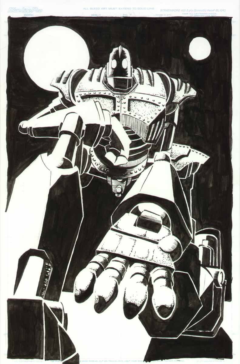
So where was I? Ah yes, common sense. Little things like, keeping in mind how big you book will be when you start creating your pages, and Oh yes, leave room for margins, gutters and bleed (trust me dear reader, when all is said and done you won't have left enough). In particular, if you draw pages, proportions 9 x 16, and then draw a cover that is supposed to bleed, you need to keep in mind that the margins will make the cover larger and change the proportion of the image. You might think that the change would be insignificant. Margins are very small, after all.

If you think this you have deceived yourself.

Because, and when you think about it rationally it really is only common sense, a book which has oblong proportions will be irregularly changed in proportion when you add trim to it. This isn't true of a perfect square, but a book that is as wide as 16x9 will change, and very quickly. All of a sudden I found that the image was going to have to be cropped. And not just a little bit. A lot. Enough that I would lose my favorite robot off of the back cover. And I know, dear reader, that I have more than once quoted Oscar Wilde about his little darlings, but this time it was more than that. (Also note that words are more easily edited than pictures.) On top of this it would then also off center the title and the symmetry of the characters on the front page. This was too much to bear. So instead I went with a look that suggests the classic wide-screen-movie-on-a-standard-television-set and added some black bars to account for the funny margins.

I hope the reader will not delude himself to think that I am now done talking about formatting my pages for I am really just beginning. See the next problem was that the printer could not print the book as widely as I had wanted and now I had to chose whether or not I wanted to change how the book would be printed.

You see comic books are made by folding a single large sheet of paper in half and creating four pages (think front and back) out of a single sheet. But to do this, especially with pages that are (proportionately reduced) thirteen inches wide would require very large stock indeed, which could not, if you must know, be run on a standard copy and saddle stitch machine. So to do this I decided to print the book stitched along the top so that the pages would open top over bottom like a calendar. In order to make this work I had to change how I set up the files...

Wait. I think I must recant what I said about just beginning to talk about formatting for it occurs to me that you have all given up by now. In fact no one will have made it far enough even to read this.

Oh well.

Maybe someone out there cares about file formatting...

It depresses the hell out of me, I swear to god.

Wednesday, September 26, 2007

Tired of Hanging Around

My book is done. I have sent it off to the printers and it is gone. I thought I might take a moment to answer what may be the number one question on the minds of you, my readers.

"How does it feel?"

Tired. I am tired. Maybe once I am holding the book in my hands that will be replaced with elation, but for now I will stick with tired.

It is a satisfied tired, like after a really long run, when the endorphins are pumping through you're system and your muscles ache and you can feel your pulse in your face, but you know that you did something good. You collapse onto the couch, but you only succeed in getting it all sweaty and it itches against your hot skin. After a shower you lay stretched out on the floor, nude, looking at the ceiling, with your towel beneath you protecting you from the dirt and lint in the carpet that longs to cling to your wet skin.

The process of production (a stage which I will define as beginning with the end of the art and lasting until you send your book to press) is long and arduous. I really felt (and I mean believed) that once the art was done I could iron the kinks in the writing out in a day and get that sucker off to print. It should suprise no one to find that I was mistaken. There is an enormous amount of effort that goes into making something, anything, look professional. This itself is a topic large enough to create a whole blog around, but for now I will just touch on the basics.

Choosing your font is extremely important. I changed the type I was using time after time after time. How many times is that? That's a lot of times. But seriously, type is important. It is the medium through which your copy communicates its message. The first font I chose because I liked the look of it, but I neglected to take into account the color of the text within the context of the book. Combine this with the fact that the font came from a very small font family and you have a fatal error.

So I changed it. I pulled together a variety of fonts, that had a variety of desirable attributes and in the end their virtue was lost on the text because of a proliferation of types of fonts destroyed their individual identities. In the end I settled on a font that had a decent sized family, which retained its identity when stroked (a true typographic sin) and which suited the needs of my text. I then used a more expressive text for the shouted words and it started to look alright. For those of you who want more one this subject, see here.

As for myself, I will stop here for today. Look for these topics to show up soon at a blog near you:

Word Balloons!
File Formats!
Forcing Words to Work with Pictures!

Excited? I know I am.

In unrelated news: The Zutons!

...well sometimes I go out by myself and I look across the waaaaaaater....

At the request of a very special friend...


Here it is folks. A real first for this site, and a moment that we've all been waiting for.

There is actually a picture in my blog about art.

I know it's crazy, but let's all stay calm and I think we'll get through this just fine. That wasn't too bad was it? Good. Now down to business for a moment.

I have at long last finished my book. The process has been long, and exciting to be sure, and now it is finished. (When I say finished I mean I have to get cracking on the next issue right away.) I haven't posted for a while, and for that I apologize. When I made my last post, over a month ago now, I sincerely believed that I was really only a week away, two at most, from being all finished up with my book. This was not the case, and I have a lot to say about that. Actually I have been quite eager to post this last month (there have been plenty of topics filling my mind) and I have had to restrain myself to keep from delaying my book even further. As a result there a number of subjects I would like to talk about and I will have the time in the coming weeks to talk about them. My hope is that I will post several times in the coming weeks (beginning immediately after this post), and in those posts I will address all of the questions and concerns that must be filling your minds about what it is like to produce a finished comic book.

In the meantime, enjoy this, the first ever picture on Eric Lynch Talks About Comics.

Thursday, August 9, 2007

Almost done. But instead... Anecdotes!

Today I am starting the second to last page of my book. And that feels good. I have to keep reminding myself that I still have to iron out the writing, draw the covers and inserts, and fix whatever mistakes in panels that I feel are unworthy of publishing. But still, it's very exciting. Since I don't post very often though, I will share a few anecdotes about art instead, and not rehash my entire previous post about milestones.

A New Brush For Eric
One of my precious tech pens (my smallest and most precious actually) recently broke on me and I learned a few lessons.

One. When your tech pens clog, do not become frustrated with them and resort to violence, even if they already may be permanently destroyed. If you destroy them, you will never know.

Two. Tech pens are the most expensive drawing implements money can buy. There is a chance that you could find even more expensive brushes made from the hairs of moogle pom-poms, but I wouldn't know where to buy them. ( I hear it takes one hundred moogles poms to make a single brush.) So given that, brushes (even the best) are cheaper, not being discontinued anytime soon, and do not need to be attained from Europe via e-bay.

Three. Brushes are hard to use. They require focus and concentration, but they can produce lovely effects. I first decided to make the switch to avoid having to purchase another tiny tech pen that would only break. However, I have decided I would like to fully integrate brushwork into my style so that I can use a brush for those fine details, which tech pens are too costly to afford, as well as for more organic forms. Ideally I would like to transition to using brushes entirely for my figures and natural subjects and tech pens for manufactured materials such as buildings, and machines, as well as for textures. Stippling is almost impossible with a brush, and quite pointless when you have tech pens.

Work takes time.
Did you know that when you are working forty hours a week, you cannot be drawing during those same hours? Somehow I had forgotten this. Now that I am again gainfully employed (yay!) I am remembering how much time that a job consumes. If you have somehow forgotten how much time a full time job takes, I will take it upon myself to remind you.

It takes a lot of time.

About forty hours a week actually! They call it full time because it is full and not part. The result of this has been that I am now again struggling forward on my book at a working man's pace, and not flying along at three pages a week, as I managed to do for one glorious week of my unemployment (the one week when I was not actively looking for work).

Words on Pages. A Perspective Lesson!
I Do not normally trace images into my comic. I feel that doing so clashes with the flow of images that are otherwise run through the filters of your mind and hands. The only big exception that I make with any kind of regularity is text. Creating text fonts, and calligraphy are two massive undertakings in and of themselves, and are also disjunct skills from illustration in many ways. I resort to tracing text into panels at times because it allows me to preserve the identity of a specific font while giving me the control to micromanage the font to suit my needs exactly.

I recently had an instance in my comic where I wanted to have a label attached to a file that was laying flat on a desk in perspective. To do this properly I would have to trace the letters. But how to put them into perspective? I first designed the stamped seal in Illustrator, then printed the stamp out so I could lay the piece of paper flat on my desk and take a photo of it from the appropriate height. I then brought the image into Photoshop and reduced it to black and white and shrank it to the size of the file in my drawing. I then printed out the picture of the text, now in perspective, and placed it under my drawing where I used a light-box to trace it into the panel.

And you know what? It looks great.

Well that's all for now. If I don't get down to work I won't ever get done. And I won't have anything to write about in the future.

Till next time friends! Ciao.

Saturday, June 30, 2007

Watching things come together.

I enjoyed a truly amazing artistic experience recently; something I have never had the chance to experience before. I scanned all my pages, approximately twenty at this point, and got them all cleaned up and laid out in InDesign. Suddenly I went from having pile of loosely connected ink drawings to having a nearly completed book. And there it was in front of me, the page spreads opened wide like the welcoming arms of a long lost friend. As I scrolled through the pages it really struck me for the first time how much work was sitting in front of me. Each of these pages takes me somewhere between twenty and forty hours of work (forty is a very unlucky page, twenty is the goal that I'm working towards for all my pages) and there they all were, starting to look like something that might get finished someday.

Some context is in order to explain how this experience had never come about before. About six years ago I wound up putting together thirty of more pages of work of comic strips for a newspaper comic that I created. They were roughly connected and certainly never put together into any kind of a book. During college I had a number of classes with large portfolios of work that were almost entirely unrelated except that they were mostly done in the same medium. I suppose finishing a sketchbook does also contain some of that same satisfaction but it isn't nearly the same in terms of impact. And late in my college career I completed forty or more pages of work for a web comic that I created which has now also gone the way of the dinosaur. It also was never collected into a book of any length, although looking back on it there was a lot there that I am still proud of. But still, it had no real plot structure. There was a small story arc contained in those pages and I suppose if we want to stretch our imaginations we could all play pretend together that there was a complete thought in there, but without the help of a certain someone I don't know if even I am that creative.

So why all this backstory? Simply to illustrate the point that, until now, I had not worked on a project for this long that had this much focus, and now that I'm approaching a truly significant milestone it is really quite rewarding to have stuck it out. Seeing those spreads is what brought it on home to me and I wanted to share that.

I'm not there yet though, so you can expect that by sometime next month I'll have noticed that I haven't posted for a while and I'll come back and give you an update on how it all comes together.

Thursday, June 7, 2007

Momentum

I must admit that I expected the results of my hiatus from drawing to be more drastic than they were. Please do not misunderstand me, I am not complaining because I didn't lose all of the ground I have worked so hard to gain. Still, on some level you could say that expectations were disappointed.

This is a bit of a hard feeling to define, but I think that I will go ahead and try anyways. We all want our lives to be epic. I mean, people in general want to feel that what they do is an accomplishment. That somehow they have overcome insurmountable odds to do something truly noteworthy. I am no exception to this rule. So I must confess that, not only do I find illustration to be challenging and at times brutally difficult, I want it to be challenging and brutally difficult. As a result of this, and also because I have experienced this in the past, I expected to have a lot of ground to make up when I picked up my pens again. And I didn't really.

So why be disappointed?

Well in part because I feel robbed of the epic struggle that I was sure was going to ensue, but also because I still did lose something, albeit less tangible, that I will still have to struggle to regain and it isn't an epic battle. It's more like overcoming the desire to hit the snooze one more time. Now I grant you that this isn't easy some mornings, but it also rarely brings the same satisfaction you get from the end of a long bear hunt.

Sitting with sweat dripping down your naked chest, covered in war paint and blood, you pull your hand made spear out of the stained, matted fur of the grizzly's throat and you feel the first shudders of the adrenaline high stealing your legs out from under you. You laugh, confident and reassured in your masculinity.

Instead of an epic struggle I have simply lost the momentum that takes so many small efforts of will to gain. It isn't that I have slid backward, I simply have to redo all the work that it took to go forward. Perhaps I should be happy that I have reached a milestone in my journey that marks a real, significant step towards professionalism in art, but right now I still want to hit that snooze button one more time.

(Languidly throws off the sheets.)

Sigh. Time to get to work.

Thursday, May 31, 2007

Getting into the swing of things.

For the moment, we will lay aside the fundamentals of page development and look at some of the issues that I have to deal with in the creation of individual pages. Right now the biggest issue facing me is getting back into the swing of things. A bout of unemployment and a long job search have made some alterations to my list of priorities over the last couple months, and as a result I haven't done a lot of work on the actual production of comics. Now, with uncertainties looming ahead I pick up my pen and sit down to work on my comic. But as I put my hand to the paper, I falter. Something is wrong.

My art muscles have atrophied.

Yes, that's right. My art muscles. And you to, just like me, have art muscles that need working out if you want them to stay in shape. Any long period that passes without a substantial amount of time being spent on the creation of art results in a temporary loss of the progress you have made over your developing career as an artist. Your muscles grow weak and frail and naught can restore them but a healthy program of steady drawing, or perhaps the promise of a trip to a mysterious chocolate factory.

Learning to draw takes time and practice and even after you make progress you can't stop because, unlike a bike, you can't just hop back on and ride. It is a use-it-or-lose-it skill, and it doesn't take long for your muscles to weaken. My next few posts will focus on the rehab program I set for myself so that you can follow along from home on a miraculous journey of heart, determination, and self-discovery.