It's been a while since I've posted, but amazingly it's been even longer since I sent my book off to the good people at ComixPress. However, at long last, my book is available in their online store, and you can have your very own copy of Drafted: A Story from the Space Marine Corps for a cool four dollars. And for a limited time you can find the book listed on the site's homepage at www.comixpress.com.
Needless to say, I am excited that it is finally up, and (while I had been planning on waiting until it was up to post again) the delay of the book's self-published release is not really the reason that I haven't been posting. Things have been very busy, and my time in the past few months for comics has been limited. Happily coinciding with the release of the book, however, I am also getting back down to work on issue two, and having a blast. More posts to follow at some point. As always, no guarantees.
Monday, April 21, 2008
Monday, October 8, 2007
Some words on words in ballons.
Everyone knows quality when they see it. A professional look is something that is not easily created, subconsciously approved of, and immediately recognized when broken with. It is much like reading facial expressions. Everyone is a master of knowing what facial expressions look like, and we all create them effortlessly everyday. After all, half our brains are devoted to analyzing faces. But try to fake a facial expression, or draw one, and everyone can see right through it. This is no less true for word balloons. We instantly recognize shoddy balloon work. And the funny thing is, that simple, natural looking word balloon is not as easy to create as you might think.
The first thing that I learned in this process was this: Use vector graphics. You will revise your text, and consequently, your word balloons so many times it will make you head spin. I admit that, when it comes to my own art, my aversion to using a computer in conjunction with my hand art is very great. At the height of my madness I thought of hand lettering and ballooning all of my text. While I still like the idea of this, to even begin to pull it off, you have to have really polished all of your text before you even begin lettering. This requires you to be well ahead of schedule on your writing, and commits you to your text when your book is not even close to compete. In the end, I found myself choosing between my own bizzare fetish and a real increase in the flexibility I could have with editing my book. I think that the path that I chose is the right one for me, and for most people who are just getting started.
Also, give some thought to altering the balloons so that they are not simply ellipses. This can easily be done with the pen tool and Bezier handles. If you don't know how to use these then read the help section of your graphics software program, I can't very well describe it here.
Give some thought to what your characters are saying. How big should the balloons be? Should they be thicker? Thinner? Spiky? These are all important decisions. Context is everything. Make the balloons as emotive as the characters that are saying them and make the words inside match.
Also, experiment with different fonts. Find a font that might be similar to the one you are using, but more distressed. Then you can use that font for shouting. If you make a comic about marines, in space, there could be a lot of shouting.
See the following examples here:
 And also here:
 Note that there is a place for hand lettered work, but it is usually in the tastefully placed sound effect. More on that.
Sound effects are an excellent place to throw around your hand lettering skills. I find that the best way to go about doing this is to trace the area that they need to fill from your drawing, then do the lettering on a separate piece of paper, and finish by giving its own layer in Photoshop so that it can be properly manipulated at will. The result is lettering that blends seamlessly with your art.
I have way too many thoughts on this to contain them all in one post so we'll come back to this later. Right now I am really tired and I'm gonna go to bed early.
Tuesday, October 2, 2007
The most boring post ever.
I am about to blog about the frustrations I have had with the file formating from my book. It will be boring. If you proceed take note that I did warn you.
When you are formating a book, particularly a comic book, there are a few things that you should keep in mind. I know what you're thinking. I can hear you sitting there in front of your monitor, thinking to yourself, "I already know to make my files at least 300dpi for print. I already know about using CMYK instead of RGB. Why are you telling me this again?"
Well, I'm not going to tell you again. (Did you see how I really did anyway? I thought that was clever.)
This has more to do with things that you might think are common sense. All those little common sense things that you are supposed to remember, but always forget, because it's just too much to keep in your head at once. And then when I mention these things (and don't tell me you won't do this because I know you will) you'll think, "Well that was obvious. How could he miss that?" (I must take care not to bludgeon my readers with this point.) And you'll have already forgotten the point, which I so carefully made in my previous parenthetical statements, about how the mind gets cluttered and confused when formatting comics, as well apparently as writing blog posts. But now I shall break for a cup of tea. (I've been reading Salinger recently, can you tell?)
So where was I? Ah yes, common sense. Little things like, keeping in mind how big you book will be when you start creating your pages, and Oh yes, leave room for margins, gutters and bleed (trust me dear reader, when all is said and done you won't have left enough). In particular, if you draw pages, proportions 9 x 16, and then draw a cover that is supposed to bleed, you need to keep in mind that the margins will make the cover larger and change the proportion of the image. You might think that the change would be insignificant. Margins are very small, after all.
If you think this you have deceived yourself.
Because, and when you think about it rationally it really is only common sense, a book which has oblong proportions will be irregularly changed in proportion when you add trim to it. This isn't true of a perfect square, but a book that is as wide as 16x9 will change, and very quickly. All of a sudden I found that the image was going to have to be cropped. And not just a little bit. A lot. Enough that I would lose my favorite robot off of the back cover. And I know, dear reader, that I have more than once quoted Oscar Wilde about his little darlings, but this time it was more than that. (Also note that words are more easily edited than pictures.) On top of this it would then also off center the title and the symmetry of the characters on the front page. This was too much to bear. So instead I went with a look that suggests the classic wide-screen-movie-on-a-standard-television-set and added some black bars to account for the funny margins.
I hope the reader will not delude himself to think that I am now done talking about formatting my pages for I am really just beginning. See the next problem was that the printer could not print the book as widely as I had wanted and now I had to chose whether or not I wanted to change how the book would be printed.
You see comic books are made by folding a single large sheet of paper in half and creating four pages (think front and back) out of a single sheet. But to do this, especially with pages that are (proportionately reduced) thirteen inches wide would require very large stock indeed, which could not, if you must know, be run on a standard copy and saddle stitch machine. So to do this I decided to print the book stitched along the top so that the pages would open top over bottom like a calendar. In order to make this work I had to change how I set up the files...
Wait. I think I must recant what I said about just beginning to talk about formatting for it occurs to me that you have all given up by now. In fact no one will have made it far enough even to read this.
Oh well.
Maybe someone out there cares about file formatting...
It depresses the hell out of me, I swear to god.
Wednesday, September 26, 2007
Tired of Hanging Around
My book is done. I have sent it off to the printers and it is gone. I thought I might take a moment to answer what may be the number one question on the minds of you, my readers.
"How does it feel?"
Tired. I am tired. Maybe once I am holding the book in my hands that will be replaced with elation, but for now I will stick with tired.
It is a satisfied tired, like after a really long run, when the endorphins are pumping through you're system and your muscles ache and you can feel your pulse in your face, but you know that you did something good. You collapse onto the couch, but you only succeed in getting it all sweaty and it itches against your hot skin. After a shower you lay stretched out on the floor, nude, looking at the ceiling, with your towel beneath you protecting you from the dirt and lint in the carpet that longs to cling to your wet skin.
The process of production (a stage which I will define as beginning with the end of the art and lasting until you send your book to press) is long and arduous. I really felt (and I mean believed) that once the art was done I could iron the kinks in the writing out in a day and get that sucker off to print. It should suprise no one to find that I was mistaken. There is an enormous amount of effort that goes into making something, anything, look professional. This itself is a topic large enough to create a whole blog around, but for now I will just touch on the basics.
Choosing your font is extremely important. I changed the type I was using time after time after time. How many times is that? That's a lot of times. But seriously, type is important. It is the medium through which your copy communicates its message. The first font I chose because I liked the look of it, but I neglected to take into account the color of the text within the context of the book. Combine this with the fact that the font came from a very small font family and you have a fatal error.
So I changed it. I pulled together a variety of fonts, that had a variety of desirable attributes and in the end their virtue was lost on the text because of a proliferation of types of fonts destroyed their individual identities. In the end I settled on a font that had a decent sized family, which retained its identity when stroked (a true typographic sin) and which suited the needs of my text. I then used a more expressive text for the shouted words and it started to look alright. For those of you who want more one this subject, see here.
As for myself, I will stop here for today. Look for these topics to show up soon at a blog near you:
Word Balloons!
File Formats!
Forcing Words to Work with Pictures!
Excited? I know I am.
In unrelated news: The Zutons!
...well sometimes I go out by myself and I look across the waaaaaaater....
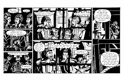
At the request of a very special friend...

Here it is folks. A real first for this site, and a moment that we've all been waiting for.
There is actually a picture in my blog about art.
I know it's crazy, but let's all stay calm and I think we'll get through this just fine. That wasn't too bad was it? Good. Now down to business for a moment.
I have at long last finished my book. The process has been long, and exciting to be sure, and now it is finished. (When I say finished I mean I have to get cracking on the next issue right away.) I haven't posted for a while, and for that I apologize. When I made my last post, over a month ago now, I sincerely believed that I was really only a week away, two at most, from being all finished up with my book. This was not the case, and I have a lot to say about that. Actually I have been quite eager to post this last month (there have been plenty of topics filling my mind) and I have had to restrain myself to keep from delaying my book even further. As a result there a number of subjects I would like to talk about and I will have the time in the coming weeks to talk about them. My hope is that I will post several times in the coming weeks (beginning immediately after this post), and in those posts I will address all of the questions and concerns that must be filling your minds about what it is like to produce a finished comic book.
In the meantime, enjoy this, the first ever picture on Eric Lynch Talks About Comics.
Thursday, August 9, 2007
Almost done. But instead... Anecdotes!
Today I am starting the second to last page of my book. And that feels good. I have to keep reminding myself that I still have to iron out the writing, draw the covers and inserts, and fix whatever mistakes in panels that I feel are unworthy of publishing. But still, it's very exciting. Since I don't post very often though, I will share a few anecdotes about art instead, and not rehash my entire previous post about milestones.
A New Brush For Eric
One of my precious tech pens (my smallest and most precious actually) recently broke on me and I learned a few lessons.
One. When your tech pens clog, do not become frustrated with them and resort to violence, even if they already may be permanently destroyed. If you destroy them, you will never know.
Two. Tech pens are the most expensive drawing implements money can buy. There is a chance that you could find even more expensive brushes made from the hairs of moogle pom-poms, but I wouldn't know where to buy them. ( I hear it takes one hundred moogles poms to make a single brush.) So given that, brushes (even the best) are cheaper, not being discontinued anytime soon, and do not need to be attained from Europe via e-bay.
Three. Brushes are hard to use. They require focus and concentration, but they can produce lovely effects. I first decided to make the switch to avoid having to purchase another tiny tech pen that would only break. However, I have decided I would like to fully integrate brushwork into my style so that I can use a brush for those fine details, which tech pens are too costly to afford, as well as for more organic forms. Ideally I would like to transition to using brushes entirely for my figures and natural subjects and tech pens for manufactured materials such as buildings, and machines, as well as for textures. Stippling is almost impossible with a brush, and quite pointless when you have tech pens.
Work takes time.
Did you know that when you are working forty hours a week, you cannot be drawing during those same hours? Somehow I had forgotten this. Now that I am again gainfully employed (yay!) I am remembering how much time that a job consumes. If you have somehow forgotten how much time a full time job takes, I will take it upon myself to remind you.
It takes a lot of time.
About forty hours a week actually! They call it full time because it is full and not part. The result of this has been that I am now again struggling forward on my book at a working man's pace, and not flying along at three pages a week, as I managed to do for one glorious week of my unemployment (the one week when I was not actively looking for work).
Words on Pages. A Perspective Lesson!
I Do not normally trace images into my comic. I feel that doing so clashes with the flow of images that are otherwise run through the filters of your mind and hands. The only big exception that I make with any kind of regularity is text. Creating text fonts, and calligraphy are two massive undertakings in and of themselves, and are also disjunct skills from illustration in many ways. I resort to tracing text into panels at times because it allows me to preserve the identity of a specific font while giving me the control to micromanage the font to suit my needs exactly.
I recently had an instance in my comic where I wanted to have a label attached to a file that was laying flat on a desk in perspective. To do this properly I would have to trace the letters. But how to put them into perspective? I first designed the stamped seal in Illustrator, then printed the stamp out so I could lay the piece of paper flat on my desk and take a photo of it from the appropriate height. I then brought the image into Photoshop and reduced it to black and white and shrank it to the size of the file in my drawing. I then printed out the picture of the text, now in perspective, and placed it under my drawing where I used a light-box to trace it into the panel.
And you know what? It looks great.
Well that's all for now. If I don't get down to work I won't ever get done. And I won't have anything to write about in the future.
Till next time friends! Ciao.
Saturday, June 30, 2007
Watching things come together.
I enjoyed a truly amazing artistic experience recently; something I have never had the chance to experience before. I scanned all my pages, approximately twenty at this point, and got them all cleaned up and laid out in InDesign. Suddenly I went from having pile of loosely connected ink drawings to having a nearly completed book. And there it was in front of me, the page spreads opened wide like the welcoming arms of a long lost friend. As I scrolled through the pages it really struck me for the first time how much work was sitting in front of me. Each of these pages takes me somewhere between twenty and forty hours of work (forty is a very unlucky page, twenty is the goal that I'm working towards for all my pages) and there they all were, starting to look like something that might get finished someday.
Some context is in order to explain how this experience had never come about before. About six years ago I wound up putting together thirty of more pages of work of comic strips for a newspaper comic that I created. They were roughly connected and certainly never put together into any kind of a book. During college I had a number of classes with large portfolios of work that were almost entirely unrelated except that they were mostly done in the same medium. I suppose finishing a sketchbook does also contain some of that same satisfaction but it isn't nearly the same in terms of impact. And late in my college career I completed forty or more pages of work for a web comic that I created which has now also gone the way of the dinosaur. It also was never collected into a book of any length, although looking back on it there was a lot there that I am still proud of. But still, it had no real plot structure. There was a small story arc contained in those pages and I suppose if we want to stretch our imaginations we could all play pretend together that there was a complete thought in there, but without the help of a certain someone I don't know if even I am that creative.
So why all this backstory? Simply to illustrate the point that, until now, I had not worked on a project for this long that had this much focus, and now that I'm approaching a truly significant milestone it is really quite rewarding to have stuck it out. Seeing those spreads is what brought it on home to me and I wanted to share that.
I'm not there yet though, so you can expect that by sometime next month I'll have noticed that I haven't posted for a while and I'll come back and give you an update on how it all comes together.
Subscribe to:
Posts (Atom)