Saturday, February 28, 2009

A little something I worked on for Christmas

Here's a piece I worked on for my Fiancee Rebekah. I got her a book for Christmas, but the cover was so bad that I thought I'd do a new one. In the end my own cover had its own set of issues, but I thought I'd share it anyways.
In color.
In black & white.

I had a bunch of musings to post on digital coloring, the peril of pink skies (it's supposed to be dawn), and illustration as cover art, but I'm out of time and I have to go. Maybe someday.

Monday, February 9, 2009

This was really hard.

I don't like to brag (feel free to dispute this I guess) but I also don't appreciate false modesty, and when I have done something hard I want people to know how hard it was. I took several cracks at this image, and wasted a lot of time trying to figure out the perspective in it. You can see several of those attempts below. The final image is by no means perfect, it does have plenty of compositional issues that we could critique to no end, but the perspective is sound. It looks a little wonky at first glance (that's one of the compositional issues) but by all means, look very hard at the perspective. It works. I'm proud of that.


This was a second attempt, building off of lessons learned in the first. At this point I am lightboxing together two layers of perspective because having all the vanishing points on the same piece of paper was throwing me off.


This is an example of one of the perspective objects that I lightboxed in. I pinpointed the axis on which the cube would pivot so that I could line it up with axis on the ship's gyroscopic thingy.


The first attempt. This one got so messy that I had to start fresh. Also, the cube is wrong.


The finished product. 

Wednesday, February 4, 2009

This blog is not dead. I am not dead.

Hello all.

It has been a while. I am stopping work for a brief moment to let the whole world know that this blog is not dead. If you follow this blog, and you don't personally know me, I am not dead. I haven't posted much recently because I have been frequently between jobs, and harried with learning new skills (ones that earn money), and sorting out getting married, and eeking out a very little time to draw.

Since I get so little done these days, I haven't been spending any of it on blogging about the drawing that I never get to do. One of the things on my list of things to do (what I am taking a break from right now) is learning web development, and building myself a personal site. When I do I may just install wordpress and move my blog there, but at least the spirit of this blog will live on.

At any rate, don't give up on me yet.

And what the heck, look at this picture!

I was totally going to write some great stuff about process. Oh well. Maybe next time.

Saturday, May 31, 2008

Con wrap up

Just a quick post here. I wanted to post the commissions I did at the con for any one who was interested. The first one was commissioned by a gentleman who apparently has the world's largest Iron Giant collection. It is pretty impressive. He came up to my booth and said that it didn't seem like I minded drawing robots. I said that that I certainly did not and he asked if I wouldn't mind adding to his collection. I was surprised because I had not quite anticipated this. In truth I had been worried that someone would come along and ask for a Catwoman pinup or something, but as soon as The Iron Giant commission was requested I realized how foolish this was. Of course no one was going to ask for something I couldn't draw because all anyone knows about me is what they see right in front of them. All my commissions were for robots and machines because that was the crowd my work attracted. Besides that the guy who drew Catwoman pinups was sitting in the booth across from me, and he was kept busy all convention.

The Iron Giant pinup can be viewed here.

My other two commissions were from a gentleman who circulated a number of sketch books all over the convention and had artists work on illustrating characters in a story of his own. I designed a space suit for a tiger furry named Earl McClaw and a destroyer ship for one of his friend's universes.

Earl McClaw in space combat gear.

Maybe the best space ship I have drawn to date. I whipped this out in a surprisingly short amount of time and rediscovered why I like tech pens.

More later. Hopefully some sneak peaks and panels, prints, and sketches. My friend was right, this blog is better with pictures.

Tuesday, May 27, 2008

Motor City in Review

As always I am behind on keeping the blog up to date. I probably should have announced that I would be attending the Motor City Comic Convention before hand, and not after, but I really didn't think to because until the Con the only people who read this space were people who knew me. And then I started selling books to strangers...

The Motor City Comic Convention was a really great experience for me. It was my first con, and my first chance to peddle my book to strangers and get honest feedback and encouragement. It was great to see people take an interest in the art and story, especially when someone would come by the booth and then go take a look at the rest of the con and come back. It let me know that even with everything else that was going on, people still wanted to come back and spend their hard-earned con dollars on my book. That felt pretty good.

It also meant that suddenly there were people who wanted to know how they could keep up to date on the story, and the progress of issue two. What a dilemma. If only, I thought, if only there was an information network that connected people all over the world which I could use to keep those who had bought my book up to date on what was happening. I cursed myself for not making a website, and then realized that I had this blog. Then I cursed myself for not making business cards (which really is shameful since I work at a print shop) and then I got out little pieces of paper and began writing down this web address. So this post goes out to all of you who stopped by my booth and received one of those little pieces of paper.

More details on the con later, including (I hope) pictures of the commissions which I did, but for now, how about some pictures of the booth. Till next time.

This was the booth. A little sparse but for the poster.

Books for sale! And you can almost see one of my commissioned pieces on the table there.

Next to me on the table you can see a sketchbook open to a character for whom I was asked to create a space suit.

I also had the privilege of setting up next to Katie Cook. She has done a fair amount of work on the Star Wars universe over the years and we got to see Darth Vader give her a hug.

Lastly a shot of me working on a spaceship piece on Sunday. More later!

Monday, April 21, 2008

For Sale: Comics. Awesome.

It's been a while since I've posted, but amazingly it's been even longer since I sent my book off to the good people at ComixPress. However, at long last, my book is available in their online store, and you can have your very own copy of Drafted: A Story from the Space Marine Corps for a cool four dollars. And for a limited time you can find the book listed on the site's homepage at www.comixpress.com.

Needless to say, I am excited that it is finally up, and (while I had been planning on waiting until it was up to post again) the delay of the book's self-published release is not really the reason that I haven't been posting. Things have been very busy, and my time in the past few months for comics has been limited. Happily coinciding with the release of the book, however, I am also getting back down to work on issue two, and having a blast. More posts to follow at some point. As always, no guarantees.

Monday, October 8, 2007

Some words on words in ballons.

Everyone knows quality when they see it. A professional look is something that is not easily created, subconsciously approved of, and immediately recognized when broken with. It is much like reading facial expressions. Everyone is a master of knowing what facial expressions look like, and we all create them effortlessly everyday. After all, half our brains are devoted to analyzing faces. But try to fake a facial expression, or draw one, and everyone can see right through it. This is no less true for word balloons. We instantly recognize shoddy balloon work. And the funny thing is, that simple, natural looking word balloon is not as easy to create as you might think. 

The first thing that I learned in this process was this: Use vector graphics. You will revise your text, and consequently, your word balloons so many times it will make you head spin. I admit that, when it comes to my own art, my aversion to using a computer in conjunction with my hand art is very great. At the height of my madness I thought of hand lettering and ballooning all of my text. While I still like the idea of this, to even begin to pull it off, you have to have really polished all of your text before you even begin lettering. This requires you to be well ahead of schedule on your writing, and commits you to your text when your book is not even close to compete. In the end, I found myself choosing between my own bizzare fetish and a real increase in the flexibility I could have with editing my book. I think that the path that I chose is the right one for me, and for most people who are just getting started.

Also, give some thought to altering the balloons so that they are not simply ellipses. This can easily be done with the pen tool and Bezier handles. If you don't know how to use these then read the help section of your graphics software program, I can't very well describe it here.

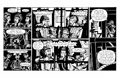
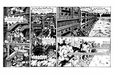
Give some thought to what your characters are saying. How big should the balloons be? Should they be thicker? Thinner? Spiky? These are all important decisions. Context is everything. Make the balloons as emotive as the characters that are saying them and make the words inside match.

Also, experiment with different fonts. Find a font that might be similar to the one you are using, but more distressed. Then you can use that font for shouting. If you make a comic about marines, in space, there could be a lot of shouting.

See the following examples here:
And also here:
Note that there is a place for hand lettered work, but it is usually in the tastefully placed sound effect. More on that.
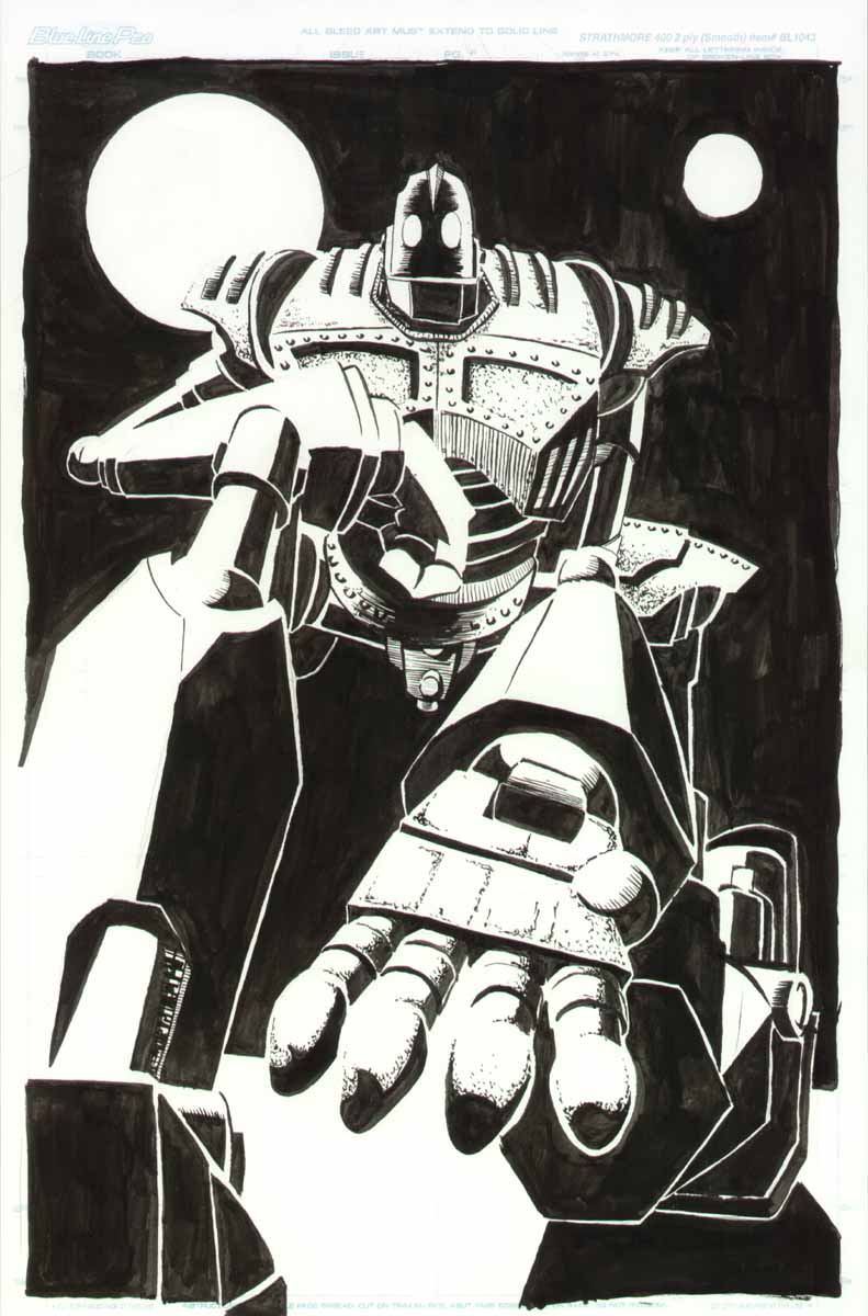
Sound effects are an excellent place to throw around your hand lettering skills. I find that the best way to go about doing this is to trace the area that they need to fill from your drawing, then do the lettering on a separate piece of paper, and finish by giving its own layer in Photoshop so that it can be properly manipulated at will. The result is lettering that blends seamlessly with your art. 

I have way too many thoughts on this to contain them all in one post so we'll come back to this later. Right now I am really tired and I'm gonna go to bed early.