Monday, October 8, 2007

Some words on words in ballons.

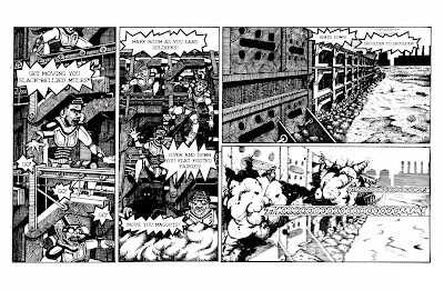
Everyone knows quality when they see it. A professional look is something that is not easily created, subconsciously approved of, and immediately recognized when broken with. It is much like reading facial expressions. Everyone is a master of knowing what facial expressions look like, and we all create them effortlessly everyday. After all, half our brains are devoted to analyzing faces. But try to fake a facial expression, or draw one, and everyone can see right through it. This is no less true for word balloons. We instantly recognize shoddy balloon work. And the funny thing is, that simple, natural looking word balloon is not as easy to create as you might think. 

The first thing that I learned in this process was this: Use vector graphics. You will revise your text, and consequently, your word balloons so many times it will make you head spin. I admit that, when it comes to my own art, my aversion to using a computer in conjunction with my hand art is very great. At the height of my madness I thought of hand lettering and ballooning all of my text. While I still like the idea of this, to even begin to pull it off, you have to have really polished all of your text before you even begin lettering. This requires you to be well ahead of schedule on your writing, and commits you to your text when your book is not even close to compete. In the end, I found myself choosing between my own bizzare fetish and a real increase in the flexibility I could have with editing my book. I think that the path that I chose is the right one for me, and for most people who are just getting started.

Also, give some thought to altering the balloons so that they are not simply ellipses. This can easily be done with the pen tool and Bezier handles. If you don't know how to use these then read the help section of your graphics software program, I can't very well describe it here.

Give some thought to what your characters are saying. How big should the balloons be? Should they be thicker? Thinner? Spiky? These are all important decisions. Context is everything. Make the balloons as emotive as the characters that are saying them and make the words inside match.

Also, experiment with different fonts. Find a font that might be similar to the one you are using, but more distressed. Then you can use that font for shouting. If you make a comic about marines, in space, there could be a lot of shouting.

See the following examples here:
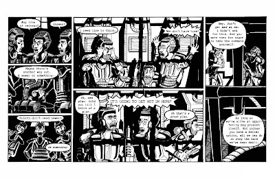
And also here:
Note that there is a place for hand lettered work, but it is usually in the tastefully placed sound effect. More on that.

Sound effects are an excellent place to throw around your hand lettering skills. I find that the best way to go about doing this is to trace the area that they need to fill from your drawing, then do the lettering on a separate piece of paper, and finish by giving its own layer in Photoshop so that it can be properly manipulated at will. The result is lettering that blends seamlessly with your art. 

I have way too many thoughts on this to contain them all in one post so we'll come back to this later. Right now I am really tired and I'm gonna go to bed early.

Tuesday, October 2, 2007

The most boring post ever.

I am about to blog about the frustrations I have had with the file formating from my book. It will be boring. If you proceed take note that I did warn you.

When you are formating a book, particularly a comic book, there are a few things that you should keep in mind. I know what you're thinking. I can hear you sitting there in front of your monitor, thinking to yourself, "I already know to make my files at least 300dpi for print. I already know about using CMYK instead of RGB. Why are you telling me this again?"

Well, I'm not going to tell you again. (Did you see how I really did anyway? I thought that was clever.)

This has more to do with things that you might think are common sense. All those little common sense things that you are supposed to remember, but always forget, because it's just too much to keep in your head at once. And then when I mention these things (and don't tell me you won't do this because I know you will) you'll think, "Well that was obvious. How could he miss that?" (I must take care not to bludgeon my readers with this point.) And you'll have already forgotten the point, which I so carefully made in my previous parenthetical statements, about how the mind gets cluttered and confused when formatting comics, as well apparently as writing blog posts. But now I shall break for a cup of tea. (I've been reading Salinger recently, can you tell?)

So where was I? Ah yes, common sense. Little things like, keeping in mind how big you book will be when you start creating your pages, and Oh yes, leave room for margins, gutters and bleed (trust me dear reader, when all is said and done you won't have left enough). In particular, if you draw pages, proportions 9 x 16, and then draw a cover that is supposed to bleed, you need to keep in mind that the margins will make the cover larger and change the proportion of the image. You might think that the change would be insignificant. Margins are very small, after all.

If you think this you have deceived yourself.

Because, and when you think about it rationally it really is only common sense, a book which has oblong proportions will be irregularly changed in proportion when you add trim to it. This isn't true of a perfect square, but a book that is as wide as 16x9 will change, and very quickly. All of a sudden I found that the image was going to have to be cropped. And not just a little bit. A lot. Enough that I would lose my favorite robot off of the back cover. And I know, dear reader, that I have more than once quoted Oscar Wilde about his little darlings, but this time it was more than that. (Also note that words are more easily edited than pictures.) On top of this it would then also off center the title and the symmetry of the characters on the front page. This was too much to bear. So instead I went with a look that suggests the classic wide-screen-movie-on-a-standard-television-set and added some black bars to account for the funny margins.

I hope the reader will not delude himself to think that I am now done talking about formatting my pages for I am really just beginning. See the next problem was that the printer could not print the book as widely as I had wanted and now I had to chose whether or not I wanted to change how the book would be printed.

You see comic books are made by folding a single large sheet of paper in half and creating four pages (think front and back) out of a single sheet. But to do this, especially with pages that are (proportionately reduced) thirteen inches wide would require very large stock indeed, which could not, if you must know, be run on a standard copy and saddle stitch machine. So to do this I decided to print the book stitched along the top so that the pages would open top over bottom like a calendar. In order to make this work I had to change how I set up the files...

Wait. I think I must recant what I said about just beginning to talk about formatting for it occurs to me that you have all given up by now. In fact no one will have made it far enough even to read this.

Oh well.

Maybe someone out there cares about file formatting...

It depresses the hell out of me, I swear to god.

Wednesday, September 26, 2007

Tired of Hanging Around

My book is done. I have sent it off to the printers and it is gone. I thought I might take a moment to answer what may be the number one question on the minds of you, my readers.

"How does it feel?"

Tired. I am tired. Maybe once I am holding the book in my hands that will be replaced with elation, but for now I will stick with tired.

It is a satisfied tired, like after a really long run, when the endorphins are pumping through you're system and your muscles ache and you can feel your pulse in your face, but you know that you did something good. You collapse onto the couch, but you only succeed in getting it all sweaty and it itches against your hot skin. After a shower you lay stretched out on the floor, nude, looking at the ceiling, with your towel beneath you protecting you from the dirt and lint in the carpet that longs to cling to your wet skin.

The process of production (a stage which I will define as beginning with the end of the art and lasting until you send your book to press) is long and arduous. I really felt (and I mean believed) that once the art was done I could iron the kinks in the writing out in a day and get that sucker off to print. It should suprise no one to find that I was mistaken. There is an enormous amount of effort that goes into making something, anything, look professional. This itself is a topic large enough to create a whole blog around, but for now I will just touch on the basics.

Choosing your font is extremely important. I changed the type I was using time after time after time. How many times is that? That's a lot of times. But seriously, type is important. It is the medium through which your copy communicates its message. The first font I chose because I liked the look of it, but I neglected to take into account the color of the text within the context of the book. Combine this with the fact that the font came from a very small font family and you have a fatal error.

So I changed it. I pulled together a variety of fonts, that had a variety of desirable attributes and in the end their virtue was lost on the text because of a proliferation of types of fonts destroyed their individual identities. In the end I settled on a font that had a decent sized family, which retained its identity when stroked (a true typographic sin) and which suited the needs of my text. I then used a more expressive text for the shouted words and it started to look alright. For those of you who want more one this subject, see here.

As for myself, I will stop here for today. Look for these topics to show up soon at a blog near you:

Word Balloons!
File Formats!
Forcing Words to Work with Pictures!

Excited? I know I am.

In unrelated news: The Zutons!

...well sometimes I go out by myself and I look across the waaaaaaater....

At the request of a very special friend...


Here it is folks. A real first for this site, and a moment that we've all been waiting for.

There is actually a picture in my blog about art.

I know it's crazy, but let's all stay calm and I think we'll get through this just fine. That wasn't too bad was it? Good. Now down to business for a moment.

I have at long last finished my book. The process has been long, and exciting to be sure, and now it is finished. (When I say finished I mean I have to get cracking on the next issue right away.) I haven't posted for a while, and for that I apologize. When I made my last post, over a month ago now, I sincerely believed that I was really only a week away, two at most, from being all finished up with my book. This was not the case, and I have a lot to say about that. Actually I have been quite eager to post this last month (there have been plenty of topics filling my mind) and I have had to restrain myself to keep from delaying my book even further. As a result there a number of subjects I would like to talk about and I will have the time in the coming weeks to talk about them. My hope is that I will post several times in the coming weeks (beginning immediately after this post), and in those posts I will address all of the questions and concerns that must be filling your minds about what it is like to produce a finished comic book.

In the meantime, enjoy this, the first ever picture on Eric Lynch Talks About Comics.

Thursday, August 9, 2007

Almost done. But instead... Anecdotes!

Today I am starting the second to last page of my book. And that feels good. I have to keep reminding myself that I still have to iron out the writing, draw the covers and inserts, and fix whatever mistakes in panels that I feel are unworthy of publishing. But still, it's very exciting. Since I don't post very often though, I will share a few anecdotes about art instead, and not rehash my entire previous post about milestones.

A New Brush For Eric
One of my precious tech pens (my smallest and most precious actually) recently broke on me and I learned a few lessons.

One. When your tech pens clog, do not become frustrated with them and resort to violence, even if they already may be permanently destroyed. If you destroy them, you will never know.

Two. Tech pens are the most expensive drawing implements money can buy. There is a chance that you could find even more expensive brushes made from the hairs of moogle pom-poms, but I wouldn't know where to buy them. ( I hear it takes one hundred moogles poms to make a single brush.) So given that, brushes (even the best) are cheaper, not being discontinued anytime soon, and do not need to be attained from Europe via e-bay.

Three. Brushes are hard to use. They require focus and concentration, but they can produce lovely effects. I first decided to make the switch to avoid having to purchase another tiny tech pen that would only break. However, I have decided I would like to fully integrate brushwork into my style so that I can use a brush for those fine details, which tech pens are too costly to afford, as well as for more organic forms. Ideally I would like to transition to using brushes entirely for my figures and natural subjects and tech pens for manufactured materials such as buildings, and machines, as well as for textures. Stippling is almost impossible with a brush, and quite pointless when you have tech pens.

Work takes time.
Did you know that when you are working forty hours a week, you cannot be drawing during those same hours? Somehow I had forgotten this. Now that I am again gainfully employed (yay!) I am remembering how much time that a job consumes. If you have somehow forgotten how much time a full time job takes, I will take it upon myself to remind you.

It takes a lot of time.

About forty hours a week actually! They call it full time because it is full and not part. The result of this has been that I am now again struggling forward on my book at a working man's pace, and not flying along at three pages a week, as I managed to do for one glorious week of my unemployment (the one week when I was not actively looking for work).

Words on Pages. A Perspective Lesson!
I Do not normally trace images into my comic. I feel that doing so clashes with the flow of images that are otherwise run through the filters of your mind and hands. The only big exception that I make with any kind of regularity is text. Creating text fonts, and calligraphy are two massive undertakings in and of themselves, and are also disjunct skills from illustration in many ways. I resort to tracing text into panels at times because it allows me to preserve the identity of a specific font while giving me the control to micromanage the font to suit my needs exactly.

I recently had an instance in my comic where I wanted to have a label attached to a file that was laying flat on a desk in perspective. To do this properly I would have to trace the letters. But how to put them into perspective? I first designed the stamped seal in Illustrator, then printed the stamp out so I could lay the piece of paper flat on my desk and take a photo of it from the appropriate height. I then brought the image into Photoshop and reduced it to black and white and shrank it to the size of the file in my drawing. I then printed out the picture of the text, now in perspective, and placed it under my drawing where I used a light-box to trace it into the panel.

And you know what? It looks great.

Well that's all for now. If I don't get down to work I won't ever get done. And I won't have anything to write about in the future.

Till next time friends! Ciao.

Saturday, June 30, 2007

Watching things come together.

I enjoyed a truly amazing artistic experience recently; something I have never had the chance to experience before. I scanned all my pages, approximately twenty at this point, and got them all cleaned up and laid out in InDesign. Suddenly I went from having pile of loosely connected ink drawings to having a nearly completed book. And there it was in front of me, the page spreads opened wide like the welcoming arms of a long lost friend. As I scrolled through the pages it really struck me for the first time how much work was sitting in front of me. Each of these pages takes me somewhere between twenty and forty hours of work (forty is a very unlucky page, twenty is the goal that I'm working towards for all my pages) and there they all were, starting to look like something that might get finished someday.

Some context is in order to explain how this experience had never come about before. About six years ago I wound up putting together thirty of more pages of work of comic strips for a newspaper comic that I created. They were roughly connected and certainly never put together into any kind of a book. During college I had a number of classes with large portfolios of work that were almost entirely unrelated except that they were mostly done in the same medium. I suppose finishing a sketchbook does also contain some of that same satisfaction but it isn't nearly the same in terms of impact. And late in my college career I completed forty or more pages of work for a web comic that I created which has now also gone the way of the dinosaur. It also was never collected into a book of any length, although looking back on it there was a lot there that I am still proud of. But still, it had no real plot structure. There was a small story arc contained in those pages and I suppose if we want to stretch our imaginations we could all play pretend together that there was a complete thought in there, but without the help of a certain someone I don't know if even I am that creative.

So why all this backstory? Simply to illustrate the point that, until now, I had not worked on a project for this long that had this much focus, and now that I'm approaching a truly significant milestone it is really quite rewarding to have stuck it out. Seeing those spreads is what brought it on home to me and I wanted to share that.

I'm not there yet though, so you can expect that by sometime next month I'll have noticed that I haven't posted for a while and I'll come back and give you an update on how it all comes together.

Thursday, June 7, 2007

Momentum

I must admit that I expected the results of my hiatus from drawing to be more drastic than they were. Please do not misunderstand me, I am not complaining because I didn't lose all of the ground I have worked so hard to gain. Still, on some level you could say that expectations were disappointed.

This is a bit of a hard feeling to define, but I think that I will go ahead and try anyways. We all want our lives to be epic. I mean, people in general want to feel that what they do is an accomplishment. That somehow they have overcome insurmountable odds to do something truly noteworthy. I am no exception to this rule. So I must confess that, not only do I find illustration to be challenging and at times brutally difficult, I want it to be challenging and brutally difficult. As a result of this, and also because I have experienced this in the past, I expected to have a lot of ground to make up when I picked up my pens again. And I didn't really.

So why be disappointed?

Well in part because I feel robbed of the epic struggle that I was sure was going to ensue, but also because I still did lose something, albeit less tangible, that I will still have to struggle to regain and it isn't an epic battle. It's more like overcoming the desire to hit the snooze one more time. Now I grant you that this isn't easy some mornings, but it also rarely brings the same satisfaction you get from the end of a long bear hunt.

Sitting with sweat dripping down your naked chest, covered in war paint and blood, you pull your hand made spear out of the stained, matted fur of the grizzly's throat and you feel the first shudders of the adrenaline high stealing your legs out from under you. You laugh, confident and reassured in your masculinity.

Instead of an epic struggle I have simply lost the momentum that takes so many small efforts of will to gain. It isn't that I have slid backward, I simply have to redo all the work that it took to go forward. Perhaps I should be happy that I have reached a milestone in my journey that marks a real, significant step towards professionalism in art, but right now I still want to hit that snooze button one more time.

(Languidly throws off the sheets.)

Sigh. Time to get to work.

Thursday, May 31, 2007

Getting into the swing of things.

For the moment, we will lay aside the fundamentals of page development and look at some of the issues that I have to deal with in the creation of individual pages. Right now the biggest issue facing me is getting back into the swing of things. A bout of unemployment and a long job search have made some alterations to my list of priorities over the last couple months, and as a result I haven't done a lot of work on the actual production of comics. Now, with uncertainties looming ahead I pick up my pen and sit down to work on my comic. But as I put my hand to the paper, I falter. Something is wrong.

My art muscles have atrophied.

Yes, that's right. My art muscles. And you to, just like me, have art muscles that need working out if you want them to stay in shape. Any long period that passes without a substantial amount of time being spent on the creation of art results in a temporary loss of the progress you have made over your developing career as an artist. Your muscles grow weak and frail and naught can restore them but a healthy program of steady drawing, or perhaps the promise of a trip to a mysterious chocolate factory.

Learning to draw takes time and practice and even after you make progress you can't stop because, unlike a bike, you can't just hop back on and ride. It is a use-it-or-lose-it skill, and it doesn't take long for your muscles to weaken. My next few posts will focus on the rehab program I set for myself so that you can follow along from home on a miraculous journey of heart, determination, and self-discovery.

Tuesday, April 24, 2007

A few words about inking before we move on to annecdotes.

I'd like to take a few words to talk about the process of inking before we move away from a strictly linear approach to discussing the creative process. Thus far I have been trying to cover the process involved in creating a single page from start to finish. Inking, at least for now, will be the last chapter in this saga.

Inking is for me the longest and most involved stage of the process. It involves a good deal of precision in the hand and eye as well as focus of mind. There are a lot of choices that I make in deciding which lines to keep and which lines to throw away. Those choices ultimately determine whether or not the drawing will succeed. Success is a combination of two factors. The first is maintaining the spontaneity and energy of the sketch. The second involves adding stability to the composition by making some tough decisions about where to place your solid blacks. Lets look at maintaining the sketch in more detail first.

Maintaining the sketch means moving quickly with your instruments in some cases, in order to keep the variety of line width necessary for visual energy, and in others not making any lines at all. In some cases lines can be omitted entirely because the form is suggested by other parts of the composition. This is the hardest thing for me to do in any specific drawing. I like closed forms. They are neat and orderly.

It makes it easy for me to color within the lines.

It is also boring. Open forms imply the lighting and atmosphere that mesh together all of the distinct forms we see into a single impression that we call vision. It adds a layer of realism. Also where light "washes out" the lines it leaves room for our imagination to fill in the details and breaks the hard paths of lines that our eyes will imprison themselves to if we let them.

Leaving room for the imagination is also one of the primary benefits of large areas of solid black. Solid black is intimidating because, especially with ink, it is final. Absolute. But it is also one of the benefits that ink gives you that you cannot achieve with pencils or chalks. It is a two-edged sword because, once down on the page it cannot be revoked and the contrast is creates cannot be ignored. But that contrast is exactly what adds visual interest to the composition as a whole. Remember as a comic artist you have to think about the compositional sense of all the panels, not just the one. And, as I mentioned earlier another of its primary benefits is that it is impenetrable to the physiological eye, but not to the psychological eye; the minds eye. This leaves the reader's imagination to fill in all the details contained within the void, and as an added bonus the details you add with your own eye are usually better than anything the artist can portray.

If I cared about the "avant garde" I would tell you that this encourages reader participation and makes the creative process a shared experience ultimately resulting in the death of the author.

But I don't care about the avant garde.

Friday, April 6, 2007

Actually sketchy business this time.

When sketching I prefer mechanical pencils to wooden pencils because the sketch itself is not the finished product. My only real requirement of my implement is that it be sharp and mechanical pencils are good for that sort of thing. I start with some light establishing lines just to get some marks down on the paper. The hardest part of any stage of drawing is to get over breaking the visual tranquility of that smooth white sea of paper. Once this is done the image begins to take shape and it becomes easier to do your thinking on the paper.

The early stages of the drawing are also the place to introduce perspective. There are two ways of going about this. The first is to simply draw the perspective points and lines directly onto the sketch. This can create a lot of visual clutter and is only advisable when the perspective needed for the scene is going to be simple and direct. The other way of going about perspective, recommended for shots with complicated angles and intricate detail, requires a light box and a perspective template. This allows you to simply place the perspective lines beneath your sketch and work from there. This keeps the clutter down and allows you to see the "clean" version of your sketch simply by toggling the light box on and off. The down side to the second approach is that perspective templates are so exact that they can be intimidating. You can often over-do the perspective in a simple view that didn't need very much perspective to begin with.

I won't go into the mechanics of perspective now, and probably not later either. People have written whole books on proper perspective and the subject is simply to large to cover adequately in any fashion here. I can recommend "Perspective! For Comic Book Artists" for those who are interested in knowing more. It has been very useful to me.

With perspective established and some simple layout lines down it becomes easier to concentrate on individual areas and flesh them out as you go. I find that the sketch, clutter or no, becomes very messy at this stage and I find myself erasing a lot. I often make the same line several times, gradually getting closer to what I want each time, shelling my target like a battleship. I then go back in and clean up my mess with an eraser. I recommended a simple kneaded eraser for this process as it leaves behind no residue and usually erases cleanly. Sometimes the drawing has simply turned into one block of graphite and I feel more like a sculptor carving away my lines like a two-dimensional Michaelangelo. The effect produced is hardly displeasing however. The better the sketch is the better the finished piece will be.

That idea should hardly be revolutionary.


Tuesday, April 3, 2007

Sketchy Business.

Going from the thumbnail to the sketch is, for me, the hardest part of the process. In this step I have to resolve my issues with perspective, finalize all of the designs for everything that appears in the panel, and settle on the final composition for the scene. Also, this is the part where I need to be able to draw. Since this is such a big step in the process I may take several posts to cover it all. We'll just have to see how it plays out.

There are a few ways to go about doing this. One of them, which works only seldom, is to just go ahead and use your thumbnail sketch. Every other blue moon I spend enough time on a particular thumbnail study with my trusty Bic that I grow attached to it. This can be bad.

Oscar Wilde once said, "Sometimes you have to kill your little darlings." I think that often holds true with sketches, at any stage of the process. You can easily become attached to a sketch that has a good characteristic about it but is not compositionally sound or is not right for the scene. At these times, as much as you love your pretty little thumbnail, you have to take it out behind the shed with a shotgun. It's a tough choice, but that's what artists do. Artists make choices.

Every now and then you don't have to do this thing, and when one of those times comes around it is a kind day. I take this stellar pen study and I scan it onto my computer at home. Then I import it into Photoshop and I blow it up to the size that the panel will be. After this step I print it out and just use it in place of a sketch. All of my sketches wind up on computer paper one way or another. I then get to use my three-hole-punch (for future reference abbreviated 3HP) to collect them in a binder, the nefarious purpose of which we have already spoken.

Before I use my trusty 3HP though, I usually tape my sketches to the back of a sheet of bristol board, on which I have already drawn out my panel borders, and I place them on a light-box to be inked. After all that is what they are there for. But I digress.

In most cases I don't have that perfect thumbnail to work from. In truth you can only use thumbnails in panels where the subject matter may allow. You could not, for instance, use a thumbnail for an establishing shot. The reason for this is elementary. An establishing shot has far too much detail to be captured properly by a thumbnail. Thumbnails work well for figures or actions that are drawn in close, emphasizing character and motion over texture and detail. I also find myself using them for scenes of chaos, aka explosions, crashes, etc... because what you want for those images, more than anything, is dynamism. In order to get this effect you have to surrender some control, which is exactly what thumbnails take away.

In most cases, however, these specialized circumstances do not occur and it's time to bust out the pencils. I really didn't mean to run on this long about using thumbnails in stead of pencil sketches but there you have it. Welcome to the land where the tangent is king. Next time. I promise we'll get there next time.

Thursday, March 22, 2007

Drawing things that don't exist.

The best way to draw things that do not exist in reality is to draw things that really do exist. Does that sound confusing? If so it is only because you have not yet become a Zen Master.

The first rule of designing anything in convincing way, be it machines, clothes, or characters, is to have source material to work from. Almost anything will do so long as you are taking in some kind of outside visual stimuli to help move your design along. I find myself spending a fair amount of time designing machinery, robots, and weapons. As a result I have a database of images built up to aid in the process. Having something to look at is invaluable. Without these aids I find that I invariably fall back on simplified geometric shapes in arrangements that are easy to work with, instead of convincing to the eye. Let's put forward an example.

I like robots, so we'll start there.

I start by coming up with a rough design of the form I would like the machine to take on paper. This usually amounts to some simple shapes and forms defining the character that I want the machine to have; just basics to start, a body and some limbs, maybe a gun turret. From there I get into the source material. The temptation is to cut the corner and cover your machine's skeleton with a a few details, some armor plates, etc. in order to make the invention look finished. But ultimately this is only a skin that makes it look finished at a glance and in the process you will have left out the guts of the thing. It might look alright on the surface, but if you place it next to an image of a real machine you will see the discrepancy instantly.

What you are seeing is the difference between flesh and blood and a skeleton with a sheet over it. (Actually that might be a cool image. But not as a machine. Remember, skeletons are cool, even under bed clothes.)

So let's work on the guts. I start by looking up pictures of other machines so I can steal parts of their structure or engineering to employ in my own machine. This machine will be something of a mechanical Frankenstein's Monster. Pieced together from the best of his piers he will represent the penultimate figure in mechanical warfare. I am particularly fond of steam-punk as a genre, so I often start working from nineteenth century images. Legs can be pieced together from images of crane arms and other hydraulic equipment. I like building frames for bodies and then adding tanks, engines, and hoses as necessary. Hoses have a wonderfully organic quality that contrasts well with the sharp corners of human engineering.

Side note: Industrial scenes look awesome in a way that I wouldn't want in my backyard, but that I love to see on paper. I might like to take a walk in the pure, untouched outdoors, and I loath the idea of forests and fields being replaced by abandoned factories and urban sprawl, but put me in a fictional universe and everything changes. I suddenly relish the texture and grit of filth that pervades industrial science fiction cityscapes. Rotting skyscrapers that blot out the sun captivate my imagination on paper in a way that inspires horror in real life. Have you ever been to Detroit? That's what I'm talking about. Although I have thought before that Detroit could solve a lot of its problems by allowing its burnt out buildings to be covered in thick masses of vines; sort of a post-apocalyptic look. The vines could consume the rubble like some freakish, tentacled, vegetable creature. More on this some other time.

The focus of visual invention is ultimately two-fold when you are dealing with story-telling illustration. First is the side that desires to make the invention look convincing. The second is the aesthetic side that desires to stretch the boundaries of the believable, still in a convincing way, but to create something that is visually appealing in its own right. This second consideration often comes after the first chronologically. Much of this aesthetic is contained in the execution of the design. Certainly there is something to be said for creating a design that is going to be visually appealing, but lest we forget, this design will never be created except by one's self on paper. As a result much of the aesthetic will be communicated in each individual portrayal of the invention that has been created. A design that looks convincing will be exciting to the viewer even if it isn't designed to look elegant. Elegance can be created in the scene that depicts the practical machine by employing perspective, line, texture, color, etc. to compose a visually stimulating image. There is also something to be said for the elegant design that is made believable with touches of source material but I will save that for later. That style is not one I am currently working with, nor am I terribly familiar with it on the whole.

That should be all for now on this subject. We'll come back to invention later (along with those vines) after we spend some time on turning those thumbnails we were talking about into finished sketches.

Tuesday, March 20, 2007

The thumbnails that you won't find on your hands.

Once I have the outline of my story laid out the rest of the process becomes more streamlined, allowing me to push ahead with production in a way that would not be possible if it were not for an efficient method. (as a side note I should mention that, when I say 'efficient,' I mean that my efforts are more focused on a goal so that the time I spend is better spent. I do not mean that I make progress quickly. I work very slowly.) After the outline the next stage of this process is thumbnailing. I find that thinking, for an artist, is often a visual process that will not adequately develop without visual aids. That's what thumbnails are. Just like the outline needs to develop on paper to help me retain my thoughts, each scene needs to be composed with simple thumbnails (often the same scene several times) in order to allow the composition to evolve to its highest form. I you have ever played Fl0w then think of it like that. Each thumbnail composition gets devoured by a larger more evolved form until the final result is a large self-confident beast, highly evolved and attractive to the females.

I usually start by breaking up the page into the moments that need to happen in that space. I then try several different visual arrangements of panels until I find one that I think is dynamic or visually stimulating in some way. From there I start working with the images that will occupy each of those panels. Thumbnails help me keep track of how all those images will look when placed next to one another. Professor David Tammany used to tell me in 2D Design that no one could know what two colors would look like together until they were placed next to each other. I believe the same is true of comic panels. You might think you know how a composition of space marines seen through an alien telescope from another planet will look when placed aside a dogfight in an asteroid field, but you don't. You will miss something if you just try and put it together in your head. You need to plan more carefully than that. I want the panels to vary from one another to create diversity of viewpoints, subject matter etc. while still retaining the compositional value of the page as a whole so that the panels work together. You see, the panels need to have contrast and diversity, and yet still be unified.

It's the oneness of duality.

Once the page layout is thumb-nailed I work on different compositional arrangements for each of the panels, again, still bearing in mind the layout. Thumbnails are not about detail, but form. The lines should be loose and electric, defining forms with quick strokes. I hold the pen further back than I usually would when I thumbnail because it forces me to surrender some control and in exchange I get more energy out of my lines. It keeps the focus of the thumbnail on composition, focal point, and motion. That energy is what ought to carry you into the pencil sketches that will be used in the final composition.

The first thumbnails I do are usually just establishing work. I'm working out what is going to be included in a scene and how I'm going to present it. The second round is often just to come up with alternate arrangements of form and to experiment with ways to make the scene look more dynamic. Some quick perspective work is helpful as well to establish how I want to incorporate the view point into the final sketch. This is also the time that I set aside to work on poses, design, and expression. If one of my marines is using a piece of alien technology then now is the time to do some concept sketches for what that piece of technology will look like. The design that goes into any object that appears on the page is crucial to having a believable world. It is so crucial in fact that I will break off abruptly here in order to devote the next whole post to the process involved in the design of unreal elements in art. Look forward to it!

That's an order Space Cadet.

Tuesday, March 13, 2007

Skeletor!

Let's set the scene for today's topic. You sit in your creative space, surrounded by your hanging plants, with your favorite working music on. In your hand you hold your cheap disposable pen of choice and in front of you are several pages of blank, white, scrap paper. You stare at the blank sheets of paper and you think, I have no idea what to write. That's ok. You never really start by just writing. If you did your story, and all the art surrounding it, would lack form, like some kind of gelatinous amoeboid. Instead of just throwing ourselves headlong into this endeavor we are going to step back and craft our story purposefully, like a designer might make a set of clothes or an architect might design a skyscraper. And while those analogies are fine, for the purposes of this post we are going to run with the analogy of the skeleton. Why?

Because skeletons are cool.

The outline of a story is like a skeleton. The bits and pieces of plot and character come together to support the story like so many vertebrae. Starting with an outline gives you the advantage of having some concept of how the story will end while you are still working on the beginning of it. This is a very real benefit, believe me. The outline doesn't have to be much. An inciting incident and a vague layout of the rising action are a good start. From there it is good to just let your thoughts take form on paper. Lest my meaning be lost on you I will repeat that last part again, on paper. The temptation is to think a good deal faster than you write, and as a result your thoughts out pace your hands until your hands are so far behind that you stop using them. Before long you are just start daydreaming about a story that you will write some day, instead of writing a story right now. Having your thoughts collected on paper gives them focus, helps you go back to an idea to develop it, and gives you the materials you need to start putting the pieces together. All these scribblings are important. Like bone marrow.

These scribblings can be anything that helps you flesh out the world on paper. Words, pictures, doodles, whatever works is what counts. All of this should ultimately culminate into a central body of work with some thoughts falling more to the center, like ribs maybe, and others falling outside the developing focus of the story, like things that are not bones. Don't feel bad about throwing away the bits of brainstorming that don't work. Right now you are focusing on an outline. With a white sheet of paper in front of you your possibilities are infinite. Infinite is a lot. Narrowing the focus is important when you are developing your plot, and when the tidbits start running away from you so does the story.

Once you have the beginnings of an outline you have the bones all in a pile and you just need to start putting them together in the right places. Sometimes you will put the bones in the wrong places. When you do your story will turn into a circus freak of a being that people will peer through a tent flap to laugh at. So, you could say putting things together the right way is important. Often you may need to bring your story in to the chiropractor.

I have a way that I resolve this problem, and it works well for me. My focus, when it comes to telling stories, is a visual one. As a result I focus on graphic novels. You know, comics. My primary interest, when it comes to comics, is the printed page, arranged into volumes, either issues or books or strips. Whatever. With any of the above choices you have definitive start and stop points throughout the story that the plot needs to be molded around. If you work on a regularly scheduled strip it is important to keep in mind the start and stop of the work week, or whatever it is you schedule your posts around. Books have a longer cycle to work with, but even then if you have a sequence of books you need to plan the story around those divisions. Right now though, we'll work with issues. I try and think about how many issues will be in a book (and in theory how many books in a story) and then I try and wrap my mind around what needs to happen in that issue. To do that I start with the end and try and connect the dots with the beginning that I've decided on. Other people, whom rumor has it are smarter than me, call this process "reverse induction."

To do this I start with a piece of paper and then I break the story down into a number of chapters, based on what needs to happen. Then I assign each chapter its own issue, which I give a working title of some sort to help me remember what will happen in it. This all gets sketched out on paper like a tree diagram, or a bone chart for a skeleton. Then, I break each of those issues down into pages, and then what needs to happen on each page or group of pages. This leaves me with lots of sheets of paper with notes scribbled all over them, and they won't make much sense to anyone except their author. But they do mean something to me. I can read them, and that's what is important. At the end of it all you should have a rough skeletal structure that you can flesh out as you go to form the body of the story. And when all is said and done the final product will look great and you can hide the skeleton away in a closet where it will rot and fester. Later it will be found by the maid. She screams as it topples down upon her, crumbling into dust as it descends.

There are a good deal of other steps involved in this process, but at the risk of running on too long for one post I will break here for today. Next time I'll get into some of the art behind all of this writing by getting into the importance of thumb nailing. I really should get to the art stuff. After all I did state quite clearly that I am not a writer.

Thursday, February 22, 2007

The tools of the brainstorming trade.

I ended the last post by promising to get into the nuts and bolts of story telling. So as not to make myself a liar, we'll dive right in today.

I often start piecing together a story with a lot of brainstorming on an idea that I already have, a kernel of some kind that I am sure will grow into a marvelous tree if it is nurtured with the proper quantities of imagination and hard work. If you don't have an idea to start working from then I don't know what to tell you. Go read a book.

Spend more time thinking.

But if you have that glorious kernel then you have a starting point from which you can create a brainstorm of hurricane force, rivaling even Katrina. I personally enjoy fueling this electrode typhoon with scraps of cheap paper and Bic pens. Cheap disposables serve a function for the cautious, focused, personality. Someone who might define him or her self as "neat." There is less pressure, psychologically, when you work with low grade instruments. With quality instruments the pressure to perform is on, and that can easily crush the tender creative sprouts that are so necessary to telling a good story.

I have developed a taste for Bic pens over the years to the extent that they have become a bizarre fetish property that I am very particular about. I find using a Bic frees me from the constraints of perfectionism when I need to brainstorm or sketch ideas. Bics also embody other characteristics that I like, however, and all disposable pens are not the same. You can still go wrong with the wrong Bic. I prefer the opaque white plastic pens over their harder clear plastic counterparts. The plastic is flexible enough to bend as you make marks, thus leveraging the character that those marks have on the page. I find black ink is better for increasing the contrast you can get with the page as well, although other colors certainly can have their uses. The retractable tip pens are more convenient also, and they don't have caps that can be lost. Another unexpected benefit is that the ink is cheap, almost sticky, enough so that you can use them to sketch with lighter lines almost like you might use a pencil. Varying pressure gives a darker line as desired.

Before I get swept away in my raptures about Bic pens, let's got back on subject and talk about paper.

Your choice of paper affects your brainstorming ethos as well. I bought some three-ring binders, a three-hole punch, and a ream of computer paper a while ago for just this reason. The computer paper is cheap and I feel no guilt about marring it's surface with bad lines. The three ring binder also takes away the pressure of wasting space in one of my precious sketchbooks. I trust you can figure out the subsequent benefits of the three-hole punch yourselves.

Over time the binder becomes a creative journal that chronicles the progress of a story in the making in its entirety. Anything can be three-hole-punched and my binders quickly accrue all sorts of things in them from penciled panels, to tracing paper, to ink blot sheets with interesting patterns. Anything that had anything to do with the creation of a story finds its way into the binder until it bulges like some scrapbook gone obscenely wrong. As it ages it takes on the look of some arcane tome of knowledge. Before I die I will bury it in a cave to be found thousands of years later as some sort of future dead sea scroll.

Peoples will war over the meaning of its contents and I shall be revered as a god.

Tomorrow we'll talk about how to use cryogenics to freeze yourself so that you will live to see a future where the howling masses worship your graven image. We'll also talk about how to start turning your brainstorm into a story.

Why comics are not like writing.

Comics differ from other methods of storytelling in many ways. As such, the process of storytelling in comics is as different as one media is from another. The primary issue created by comics is one involved with editing. In non-visual forms of story telling it is relatively easy to go back and re-write or edit previously written material. This is substantially different from the prospect of being forced to re-drawing a particular scene in a comic. The implications of this do not become clear until they translate into practice. Let me put forward an example.

You want to draw a scene in which two characters are having a conversation over lunch. Halfway through the scene you decide that the scene is really better suited for a bar than for a restaurant.

A re-write is in order.

If you are writing a book you can go back and change the setting of the scene, rework some of the details, and adjust the story accordingly. Now, I do not consider myself a writer. I have always focused on visual arts, and visual storytelling. It isn't that I can't write, or even that I don't, rather I have chosen to focus my time and energy on other things. That being said, I have written before. I have personally experienced the difference between these two media. I am not putting writers down when I say that it is much harder to edit comics. Allow me to continue with the example.

You are creating a comic book. You want to switch from a restaurant to a bar. Unfortunately you are not working with an idea made up of words. You are working with a physical product sitting on the table in front of you. The ink is drying, seeping into the page like an oil stain on your driveway, and now that you see it, in practice, you realize the truth. The only way to make the switch is to redraw everything. The entire page, for as many pages as you have been working on this scene, must go. Let us now take this to its logical conclusion.

Do you want someone sitting instead of standing? You can't change it. Do you want your two characters to shake hands instead of hugging? You can't change it. Do you want you characters to wear sweats instead of suits? Guess what! You can't change it. The only way to fix something that is in any way important to the scene, is to redraw the entire scene. You can't just keep the parts that you liked. If you are a writer, you could change the setting and keep the dialog. No problem. Making a character stand or sit would be as easy as re-writing the action. Comics are different. Comics are like a concrete sidewalk. A lot of preparation goes into the job before you start pouring, but once you do start, it sets up fast. And once your sidewalk has set the only thing you can do is to get out your sledge hammer.

What is the lesson that we need to learn here? Do your prep work right. Plan ahead. If you are used to writing a story as you go, take a word of advice. Don't. You can't have a curving walk once you've given it corners. If you don't think it all the way through before you start you will wind up with a mess.

So what kind of prep work do you do? Ah... Now we get down to it at last.

Process.

Process is everything. Everything we have been discussing until now has just been to lead up to the specific mechanics involved with story creation. Next time, we'll get down to the nuts and bolts.

Tuesday, February 20, 2007

The importance of being creative.

I was going to take a few words this post to address some of the narrative issues involved with storytelling in comics. Before I could put my plan into practice, however, I was confronted with an even more pressing concern in the sphere of creative decision making. The issue now at hand is Creative Space.

If you are involved at any serious level in any creative enterprise you will by now have discovered that you don't seem to want to work just anywhere. There are special places or certain variables that need to be fulfilled before you feel that you are in the right mind to write or draw or compose that ode to your long dead childhood pet that you have postponed writing until conditions were more favorable. Recognizing that this is true is an important step to resolving the conflict that wages within your raging creative bosom. An only slightly less important step is that, once having ceded this incontestable truth, you immediately set about identifying the variables that are so key to success in your own creative endeavors. Meeting the identified criteria is often not that hard, but identifying these criteria often leaves you in the role of the illustrious Dupin, sleuthing out answers to the unsolvable where others have failed, and failed miserably. These answers, obviously, will not be the same for everyone.

Sometimes they are very bizarre.

Counter to what you may initially think, location is not the most important variable to nail down. In point of fact almost any location can be made suitable for work if the other important factors are identified and met. Perhaps I can lend a hand, from my own experience, as you attempt to make your way through twisting labyrinths of illogically deduced riddles. But more likely, far more likely due to the personal nature of one's Creative Space, this will be a textbook case of the blind leading the blind.

I first thought that one of the criteria necessary for me to get comfortable in my own Creative Space was to have everything put in order. Dishes cleaned, bills paid, hydrangeas watered. The opposite is true. The people who look the busiest are quite often the greatest procrastinators alive. But what they have found, which makes them so productive, is an eternal wellspring of energy that (and I say this at the risk of redundancy) can never be exhausted. They have found something that they can always put off.

As long as my immediate Creative Space is in order, as long as my horticulture is taken care of, all I need is a list of things that desperately need to be done. Then, I can avoid doing these things by working hard on my comic. The level to which I am capable of doing this is epic. On some days I find myself putting off making the list of things that I need to put off. On these days, great feats are accomplished.

Creating a consistent atmosphere is key to providing the focus necessary for Creative Space. For me, the largest part of this Space is my music. In this modern world of scientific wonderments, music is portable. This is a benefit that allows you to take some of your Creative Space with you. After all, it is sometimes necessary to have more than one creative arena. A place at work, home, and school for instance. This being said, there is one area that will be the Capitol of your small creative City State. This is the area where I keep my hanging plants. Hanging plants may not be your thing and I understand that. But whatever these elements are you need to identify and procure them. No amount of fussing should be considered over-indulgent.

Once this area is settled upon I recommend you move in the bulk of your creative implements. This infestation of artistic accessories will cement this space as your own in much the way that I imagine wasps secure their hive to your home, stuck to your gutter near the door you need the most. Waiting.

You will undoubtedly find that once you are comfortable, and this area has become familiar, you may not want to work anywhere else. Do not be alarmed. That was half of the point. The purpose of your creative space is for it to help you when you are there. By definition your creative space cannot be everywhere. If it means that you have a tough time "getting creative" in the check-out isle, well, sacrifices must be made.

Once you have christened this space you may find that you are able to get down to work there in a way that you cannot rival anywhere else. That is the ultimate point of your Creative Space. The value of having a workplace where you can create effectively far outweighs the downside of not feeling in the mood to work when you are not there.

Thursday, February 15, 2007

The Greatest Story Ever.

It's really easy to read a book or a comic or watch a movie and never think about everything that went into the creation of even the simplest of stories. There are plenty of stories that I've read that I have thought were, shall we say, less than stellar. And when you take in one of these stories you think, "Man that was terrible. I could totally tell a better story." And you might be right. But what you don't realize is that it is going to take a lot of work for you to prove it. Let me add some context to my rambling.

I am currently working on telling that totally better story. In fact I am currently on page sixteen of the first issue of a comic about Space Marines. Space Marines are awesome. And the conclusion I reached (somewhere around page seven) is that knowing you can tell a better story and actually doing it are two very different things. I think that, at some point, most of us who identify ourselves as human beings have had an idea for a story. It usually gets as far as having the beginnings of a shell of a plot before we become convinced that this is, in fact, the greatest story ever.

Maybe if you're industrious you scribble out some notes about this incredible plot, or you start making some character profiles or sketches. At this point you believe you have accomplished the really hard part. You have an idea. Other people don't have ideas. Certainly not ones as great as yours. Maybe you believe that all that's left is to flesh out the details and you'll have it. Your mind races around gathering up bits and pieces, "specifics" that you think are really important to making your world a believable one. You might even spend a long time compiling lots of these "specifics" which you collect in a notebook, or three-ring-binder. Now all you have to do is sit down and hammer it out. If you have ever done any of the things I have just described above, if you are that type of person, let me enlighten you.

You are not within a hundred miles of a great story.

I have been that person before. I may very well still be that person now. That is why I am writing this. I seek to chronicle the creative process behind the story which will eventually give itself birth from the loins of my mind. That is what this blog is going to be. At all of page sixteen I am hardly a hardened professional imparting trade secrets to the "green horns" who look up to me expectantly, waiting for tidbits of hard won knowledge to fall from mouth, like so many small flightless birds in a twiggy nest. I am, however, one step beyond that wide eyed phase of "specifics" scribbled in notebooks, or three-ring-binders. So that is where this journal begins. If lengthy analysis of the creative process of making comics does not sound like something you will be interested in, I recommend that you get off at the next station.

The ride will likely only become more turbulent from here.

Forthcoming will be my thoughts on the writing process for those first pages and the difficulties that comics present to writing a story "as you go." But for today, I will stop here.

Tuesday, February 6, 2007

Does this thing work?

Testing. One, two... ... Awesome.